Color Pairing Secrets That Elevate Any Outfit
Unlock color-wheel tricks, undertone cues, and easy formulas—like 60-30-10—to mix hues with confidence and make every outfit look intentional.
The Power of Neutrals
Think of neutrals as the backstage crew that makes every star performance possible. Black, white, gray, navy, camel, olive, chocolate, and stone form a flexible base that quietly elevates brighter notes. The secret lies in undertone and value. Cool neutrals like slate and charcoal flatter icy blues and berry tones, while warm neutrals such as camel and cocoa cozy up to terracotta and mustard. Build a column of color with one neutral from shoulder to hem, then add a vivid shoe, scarf, or bag for instant polish. Denim, especially in mid to deep washes, behaves like a universal neutral that grounds prints and saturated tops. Use the two neutrals plus one accent formula when you are unsure: two calm shades anchor a single statement hue. Vary texture within the neutral family to avoid flatness; a matte knit, a glossy belt, and a brushed wool coat create quiet depth. This is how saturation control, subtle contrast, and thoughtful placement make everyday outfits look intentional.
Contrast and Balance
Mastering contrast is the fastest route to looking put together. Contrast refers to the distance between light and dark, muted and bright, matte and shine. High value contrast feels crisp and architectural; low contrast reads soft and blended. Start by pairing a saturated piece with a more muted partner so color energy feels balanced, not overwhelming. If you wear a bright top, temper it with a darker neutral bottom and a mid-tone jacket to create a gentle gradient. Consider visual weight and proportion: large blocks of bold color command attention, while smaller accents like cuffs, piping, or a slim belt whisper. Echo a hue in two places, such as shoes and earrings, to create harmony without being matchy. Use negative space—skin, a light camisole peeking through, or sheer panels—to lighten dense palettes. Keep one bridge neutral running through the look to tie competing colors together. When in doubt, step back and squint; the overall balance should feel stable, not top- or bottom-heavy.
Analogous Harmony
For easy elegance, try analogous pairings—colors sitting next to each other on the wheel. Think teal with navy and sea green, rust with terracotta and camel, lilac with violet and soft indigo. This approach creates harmony because the hues share DNA, letting you play with saturation and temperature while staying coherent. Build a subtle gradient by layering light to dark from face to hem, or reverse it for drama. Patterns thrive in this family: a floral skirt with teal and sky notes pairs effortlessly with a solid sapphire knit. Add a belt or bag that sits between the two main shades to act as a color blender. Keep textures varied—ribbed knits, suede, silk—to introduce dimension without breaking the scheme. If you crave a small jolt, introduce a neutral with character, like olive or charcoal, which respects the palette while adding sophistication. The result is a refined, modern look that whispers instead of shouts, yet never fades into the background.
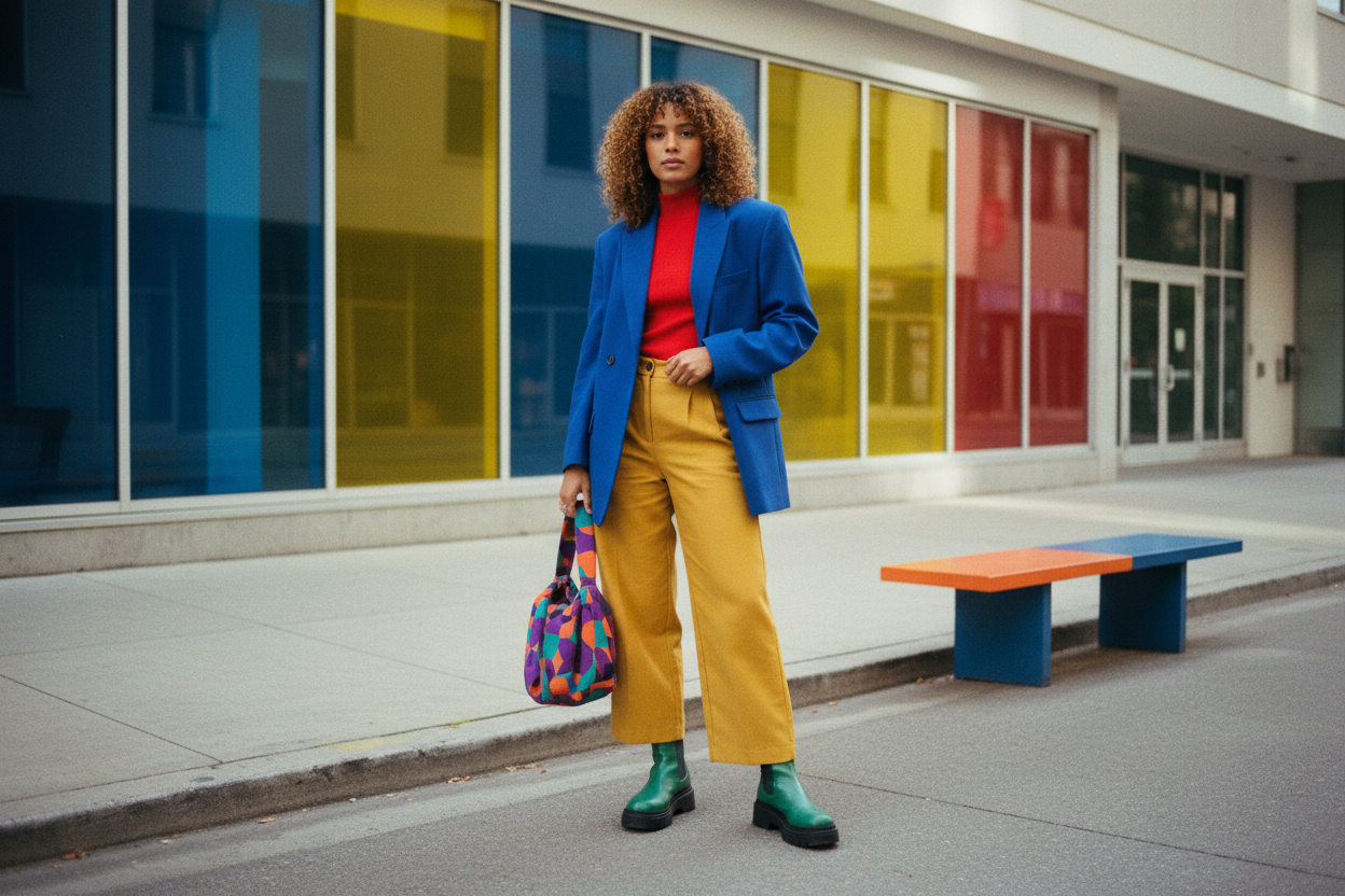
Complementary Pop
Opposites attract in fashion just as they do in art. Complementary pairings—blue with orange, purple with yellow, red with green—deliver instant energy. The key is ratio and restraint. Try the classic 60-30-10 guide: sixty percent neutral, thirty percent a primary color, and ten percent a lively opposite used as an accent. A navy suit with a burnt orange bag, or a forest sweater with a slim cherry belt, feels confident without tipping into costume. If bold blocks intimidate you, find prints that already unite both hues; then pull one color into a solid layer for clarity. Metallics like gold or gunmetal function as mediators, softening sharp contrasts. Place higher-impact complements away from your face if your complexion prefers calm. Experiment with color blocking on sneakers or outerwear while keeping inner layers quieter. When used thoughtfully, complements add focus, sharpen lines, and make even simple silhouettes look editorial.
Monochrome Depth
A monochrome outfit is the epitome of effortless chic, but the secret lies in depth. Choose one hue—say, olive, cocoa, or ink—and play with value shifts and texture to avoid flatness. Mix a matte knit with a satin skirt, suede boots, and a soft wool coat; the interplay of sheen and matte keeps the eye moving. Use tonal layering to elongate; a continuous column of related shades creates height and serenity. If you add a belt, let texture do the talking rather than introducing a new color. Accessories in near-neutrals, like pewter or brushed gold, complement the mood without breaking the spell. A touch of transparency or ribbing introduces shadow and light within the same palette. Even makeup can support the story: a toned-down lip or nail in the same family enhances cohesion. Monochrome done right feels intentional, sculptural, and quietly powerful, delivering maximum sophistication with minimal complication.
Texture and Fabric Influence
Color is never just color; texture and fabric shape how hues read. Matte cotton and linen can soften brights, while silk and satin amplify saturation through luster. Velvet absorbs light, deepening tones; leather intensifies, making colors appear richer and sharper. Ribbed knits create micro-shadows that add subtle depth, while sheer overlays shift perceived hue without changing the base—think a gauzy charcoal over a cobalt shell for a stormy blue effect. Prints vary by surface: a crisp poplin keeps patterns graphic, whereas a slubby weave blurs edges for a painterly look. Even blacks can clash when fabrics differ dramatically, so separate mismatched tones with a buffer layer like gray or denim to make the difference feel intentional. When mixing multiple colors, change one variable at a time—either texture, value, or saturation—to maintain clarity. Understanding weave, pile, and finish gives you precise control over how your palette performs in real life.
Undertones, Lighting, and Personal Palette
Your best color pairings start with your undertone—warm, cool, or neutral—and how hues interact with your features. Warmer complexions glow with terracotta, olive, and honeyed neutrals, while cooler undertones sing with slate, berry, and true navy. If you are somewhere in the middle, focus on mid-temperature shades like teal, taupe, and soft mauve. Consider lighting: daylight reveals true color, while indoor warmth can tilt hues cozier, so test combinations near a window and in interior light. Build a personal palette with two core neutrals and three accent families to mix endlessly. When evaluating outfits, take a quick grayscale photo to judge value contrast objectively. Keep the most flattering tones near your face, then play more freely with bolder or experimental colors below the waist. Small levers—lip color, nail polish, eyewear frames—can tune harmony without changing your clothes. Over time, your curated color map turns dressing into an intuitive, repeatable joy.